
Nabu Studios
We spent two evenings perfecting a funnel, then drew a star instead. Here's why, and why its squares are a little uneven on purpose.
- Areas
- Media
- Who worked on it
- Raghad, Awab, Ali al-Hilali
- When
- July to October 2026
- Where
- Baghdad, Iraq
A mark with three jobs
We work in three areas: media, software and growth. The name is borrowed from Nabu, the Mesopotamian god of scribes and writing.1
Before anyone drew a thing, we filled in a brand questionnaire about ourselves. Two answers set the brief. The look should be modern, with traditional cultural influences. And it must not look like just a marketing agency, or just a software company.
A mark built on one of those areas would tell a third of our story, and we'd spend forever explaining the other two.
Our first try, in clay
Our first logo, in July, was a terracotta clay tablet holding four cuneiform wedges, with the A of NABU cut as a wedge. One glance and you thought Mesopotamia.
It was also deep and dull. Earthy, heavy, and closer to a museum case than to a studio that builds software. We kept the wedge and let the rest go.

Fifteen directions, one evening
On September 3 we reopened the question and went through fifteen directions in a single evening.
Four put an eagle front and center: assembled from wedges, stepped like a ziggurat, carved in relief, drawn in one line. Five paired color and type with a quieter mark, sometimes a single wedge, sometimes no mark at all. Six drew cuneiform in pixels: the wedge, the basic stroke of cuneiform, rebuilt from the smallest unit of a screen.2
Only the pixel set felt like us.
Eagle
Scribe 
Ziggurat 
Relief 
Studio


Color and type
Clay and Ink 
Night Scribe 
Reed and Silt 
Bazaar 
Ochre Studio


Pixel cuneiform
Stylus 
Ligature N 
Tablet 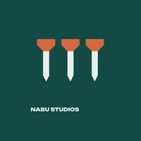
Three 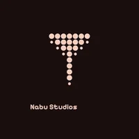
Impress 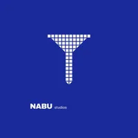
Lattice


A funnel, of all things
We picked Lattice: a wedge drawn as a grid of small squares, shaped like a funnel. The wedge is the stroke every cuneiform sign is made of. The funnel is the shape every marketer draws. One mark, two histories.3
Then we spent two evenings pushing it as far as it would go.

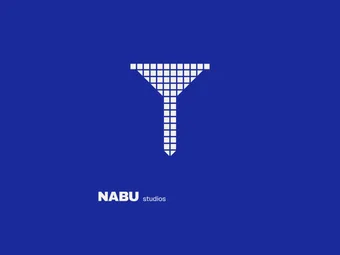
Lattice, where it started. 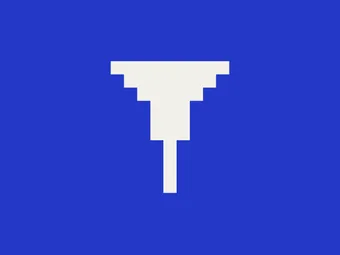
Chunkier and more 8-bit. It started to read as a letter T, or a Greek column, so the head became a funnel with a point. 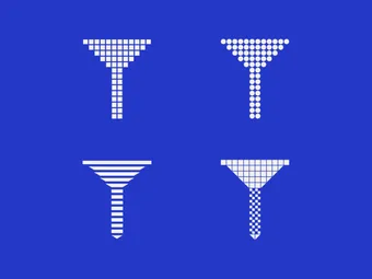
The same shape drawn ten ways; four of them here. 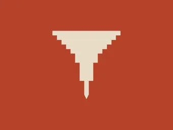
Bolder squares, solid, with a tail that tapers to a point. 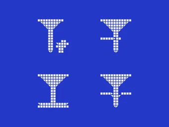
Extra strokes to make it read more like script. They looked like decoration, so out they went. 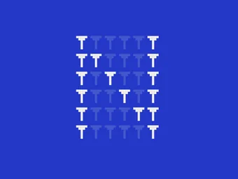
An N built from thirty-six small funnels. 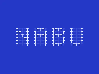
The whole word, spelled in funnels. 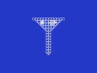
Nabu's name in cuneiform, 𒀭𒀝, written inside the squares.


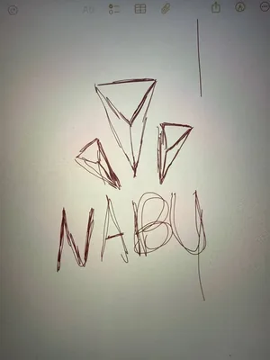
Three wedges over the word, sketched on an iPad.
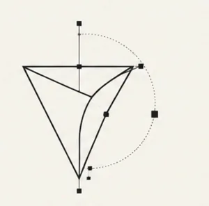
A single wedge, constructed with curves.
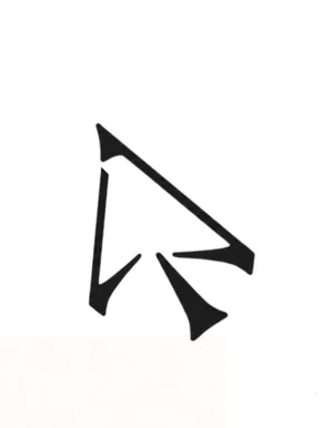
A pointer built from wedge strokes.
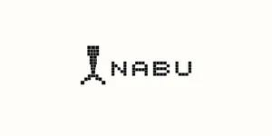
A pixel stylus beside a pixel NABU.


Why the funnel had to go
Every version of the funnel told the same story: marketing. We also make media and build software, and a funnel has nothing to say about either.
The way out came from the last thing we tried on it: writing Nabu's name in cuneiform inside its squares. The name begins with 𒀭, dingir, the sign scribes wrote before the name of a god.4 It's one of the oldest signs in cuneiform, read as “god” and as “heaven”. And it's an eight-pointed star.
The star belongs to the name, not to any one service. Eight points don't point one way, which suits a studio that does more than one thing. Drawn in squares, it's plainly made for a screen. So we stopped polishing the funnel and started drawing the star.
108 squares, spaced by eye
Raghad drew the star by hand, one square at a time, 108 squares in all. First we tried perfect spacing: every gap the same, every square on one grid. It was correct, and it looked like a machine made it. So we spaced it by eye.
Along the straight arms, the gap between squares is a third of a square.5 In the triangular heads it opens to nearly half, so the heads look lighter than the stems. The two arms on the left turn their squares to follow the diagonal, while the others step like stairs. The east arm stops short of the other straight arms.
None of this follows a rule. It's closer to a scribe's hand in clay, which never presses the same stroke quite the same way twice. That's why the uneven version won.
- One square.
- A gap of a third of a square, along the arms.
- A gap of nearly half a square, in the heads.

The word stays plain
Along the way we set NABU in about a dozen typefaces, among them Manrope, Syne, Archivo, Instrument Serif, Unbounded, Pixelify Sans and Bricolage Grotesque. We also drew the word itself in pixels, first from small funnels, then as square letters next to the star. Two pixel shapes side by side fought for the eye.6 The mark already carries the pixels, so the word could stay plain.
We settled on Bricolage Grotesque Light, stretched to 116 percent of its width.7 That's the weight the brand book draws. The website's design sets the word in Bold, which is the version in this page's header. The light weight keeps the letters from bullying the fine squares of the star. The stretch gives a short, four-letter word enough breadth to sit beside a mark that is almost square.
In the lockup the capitals stand nine squares tall, about three tenths of the star's height. Side by side, the word sits 4.3 squares from the star. Stacked, it sits 5.7 squares below it. Running text is set in Lato for English and Zain for Arabic.8


- Capitals: nine squares tall, about three tenths of the star.
- 4.3 squares between star and word.

- Capitals: nine squares tall, about three tenths of the star.
- 5.7 squares between star and word.
Clay, with the lights on
The terracotta came from clay, and it looked like clay: deep, dull, earthy. On a phone, among everything else shouting for attention, it went quiet. So we kept the warmth and turned up the brightness.9
The new orange, #f55312, is fired clay lit from behind, the way a screen lights a color. We use it sparingly: the mark, small markers, the underline under a link.
Sand, #e6dbcc, is unfired clay, the color of a tablet before the stylus touches it. Taupe, #a79788, carries rules and the quieter text. Black does the writing.
July
- Terracotta#b05c2e
- Clay#e8b489
Now
- Orange#f55312
- Sand#e6dbcc
- Taupe#a79788
- Black#000000
The kit we ended up with
The finished identity is a small kit: a horizontal lockup, a stacked one and the star on its own, each in orange, black and white, across four grounds.
The same squares draw a set of 32 cuneiform signs that we use as icons and quiet decoration. And on this site's home page, point at the star and it breaks into its 108 squares. Move away and it pulls itself back together.


Sources and further reading
9
Numbered in the order they appear. Entries marked Further reading are research and methods that match choices on this page; we read some of them afterwards.
Further reading
1Tudeau, J. (2019). Nabu (god). Ancient Mesopotamian Gods and Goddesses. Oracc and the UK Higher Education Academy.
A scholarly profile of Nabu: patron of scribes, god of writing and wisdom, whose emblem was a single wedge standing for the scribe's stylus.
Further reading
2Robson, E. (2025). Wedges and signs. Knowledge and Power: Cuneiform Revealed. Higher Education Academy, hosted on Oracc.
A plain introduction to how cuneiform was written: every sign is built from wedges pressed into clay with a reed stylus.
Further reading
3Strong, E. K., Jr. (1925). Theories of selling. Journal of Applied Psychology, 9(1), 75-86.
A 1925 article that credits the advertiser E. St. Elmo Lewis with the steps of attention, interest, desire and action, the stages a marketing funnel still draws.
Further reading
4Robson, E. (2012). Categories of signs. Knowledge and Power: Cuneiform Revealed. Higher Education Academy, hosted on Oracc.
Explains that the star sign was written, unspoken, before a god's name, and also stood for the words “god” and “heaven”.
Further reading
5Wagemans, J., Elder, J. H., Kubovy, M., Palmer, S. E., Peterson, M. A., Singh, M., & von der Heydt, R. (2012). A century of Gestalt psychology in visual perception: I. Perceptual grouping and figure-ground organization. Psychological Bulletin, 138(6), 1172-1217.
A review of a century of research on how the eye groups what it sees: things placed close together read as one shape, which is how small gaps let 108 squares read as one star.
Further reading
6Reber, R., Schwarz, N., & Winkielman, P. (2004). Processing fluency and aesthetic pleasure: Is beauty in the perceiver's processing experience? Personality and Social Psychology Review, 8(4), 364-382.
Reviews evidence that people find a design more pleasing the more easily they can take it in, with clear figures, strong contrast and symmetry all helping.
What we worked from
7Triay, M. (2022). Bricolage Grotesque [typeface]. Google Fonts, SIL Open Font License.
The typeface of the NABU wordmark, designed by Mathieu Triay and free to use under the SIL Open Font License.
What we worked from
8Dziedzic, Ł. (2010). Lato [typeface]. Google Fonts. Boutros Fonts (2024). Zain [typeface]. Google Fonts. Both SIL Open Font License.
The two typefaces for running text, Lato by Łukasz Dziedzic for English and Zain by Boutros Fonts for Arabic, both free under the SIL Open Font License.
Further reading
9Labrecque, L. I., & Milne, G. R. (2012). Exciting red and competent blue: The importance of color in marketing. Journal of the Academy of Marketing Science, 40(5), 711-727.
Four studies on color in branding, one of which shows that a color's saturation and lightness, not only its hue, strengthen the personality a brand projects.
“Nabu, the Mesopotamian god of writing and wisdom, is where our story begins.”