
This website
More than fifty home pages, and the one we kept is almost empty. On purpose.
- Areas
- Software
- Who worked on it
- The Nabu Studios team
- When
- July to November 2026
- Where
- Baghdad, Iraq
- Made with
- Next.js, and AI design and coding tools directed by our team
For the evening after the meeting
This is the website of Nabu Studios, a full-service creative studio in Baghdad: media, software and growth for businesses in Iraq. We designed it between July and October 2026, built it in October and rearranged its home page in November, with Arabic and English as equals.
Most of our work starts with a conversation, in an owner's office or on the phone. That evening the owner looks us up on their phone, to check that the people who sat with them are real. The brief for our first designs, in July, said it in two sentences: “the site is not the pitch. The pitch already happened.”
So the site has one job: make it feel safe for an owner to tell us about their business. Everything on it serves that first message: who we are, what we make, the work we've done, how we work, and the people the owner would meet.
And it has to do that on a phone, often on a slow connection, in whichever of the two languages the owner reads first.
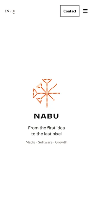
The first screen on a phone. 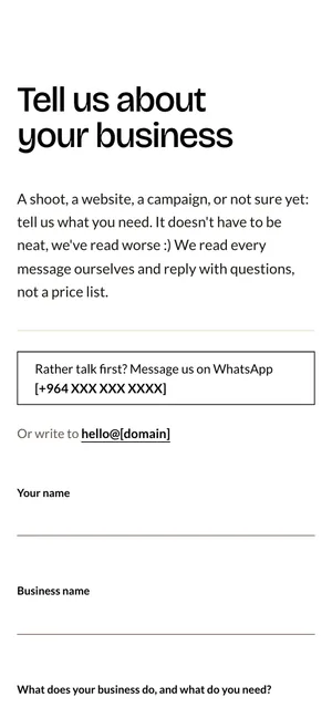
The form an owner fills in, with WhatsApp right beside it.


A summer in clay
In July our logo was a clay tablet pressed with four wedges, in terracotta, and the first designs for the site took the tablet at its word. On the night of 24 July we looked at six directions: a page washed in terracotta, a page laid out like a ledger, a page in black-fired clay, and then, when we asked for something grayer and more literal, three pages made as tablets of unfired clay.
The site we built that summer was a stamped document: a terracotta jacket around a cream card, with numbered fields, a serial number and one button. Its pages sent no JavaScript at all.
We kept exploring around it. On 4 August we laid the same buttons, forms and headings out in four materials, terracotta, reed, basalt and glazed lapis, to see which one the studio was made of. In the same session the dingir sign, the star scribes wrote before a god's name, was pressed into gray clay as a candidate signature for the footer. Weeks later that same sign became our mark.
Before choosing anything, we went through 265 landing pages of studios, agencies and software companies, on a laptop and on a phone, and kept 49. The rejects taught us more than the keepers. Twenty-two of the twenty-four brand and design studios went. All eleven sites built to show off motion and 3D went. Eleven of the twelve studio home pages we liked on a laptop fell apart at phone width. Of twenty-five Arabic and Gulf sites, two survived on a laptop and none on a phone.
Plain software studios won almost every comparison. It took us two more months, and plenty of detours, to build a site that agreed with them.
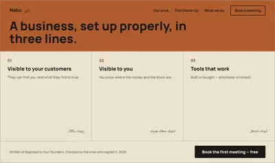
Ledger, 24 July. 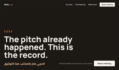
Impression, 24 July. 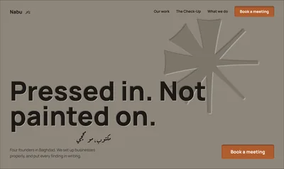
Stylus, 24 July.


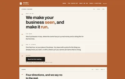
The site we built that summer: a stamped document. 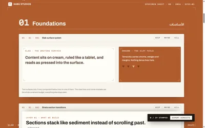
The specimen sheet, 4 August. 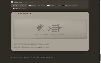
The dingir sign pressed into clay, 4 August.


More than fifty home pages, and a tie
By mid-August we had a working site and no agreement on how it should look. Our UI designer drew a dark page around the line “Building sales systems for you”, with a diagram of where customers come from and where the work goes. We rebuilt it twice: once as drawn, and once with the same words made to move.
Then we went wider. On 13 August we set up twenty landing pages, each in its own world, and had each one judged blind against the one before it, on a written rubric, by judges who didn't know which page was which. Four reached the final. On 2 September we picked Clay Garden, a soft, sunlit page with a terracotta tablet you could press, and the next day asked for five variations of it.
The judges couldn't tell them apart. Every variation scored inside the noise of the scoring itself, and the write-up said so plainly: “every remaining question is a taste question about which world Nabu should live in, and that is not a question a rubric can answer.”
Most of these pages were drawn and judged by AI tools, from briefs we wrote, which is how there could be so many. From the first night in July to the last in October, this home page went through more than fifty versions. What we took from them: drawing a page has become cheap. Deciding which page is true has not.
At the start of October our new mark arrived: the dingir star drawn in 108 squares, in orange, black and sand. None of the summer's pages was made for it. We could have repainted Clay Garden. Instead we wrote a new brief that described the studio and the page, said nothing about style, and left that to the brand book.
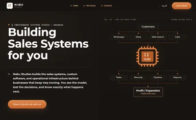
The dark page, 13 August. 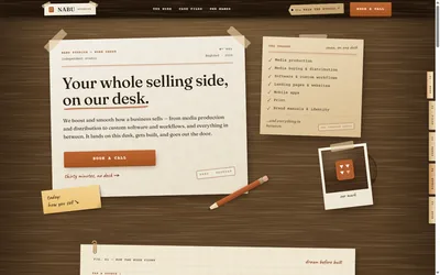
The desk, one of the twenty. 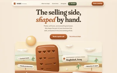
Clay Garden, picked on 2 September.


Nine looks, all about us
The first page drawn from that brief, on 4 October, followed the brand book to the letter: sand, black rules, orange for the one button, and the mark in a square frame. We asked for something completely different and got a black page textured with the mark's dots and a new headline, “Sell better. Run smoother.” A pasted brief about the early web then turned it into the gray bevels of a 1990s desktop.
On 6 October we asked for six art directions at once, with the tone set at seven on a scale where zero is serious and ten is playful and loud. Back came a clay tablet with lapis blue, a pixel game world, raw brutalist web pages, a page that reads right to left first with our Arabic name stretched across it, turn-of-the-century chrome and gloss, and a glossy magazine.
Each one was striking. Laid side by side, each one was mostly about us and our taste. Not one was about the owner checking us out on a phone after a meeting.
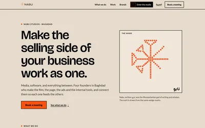
The first page on the new brand, 4 October. 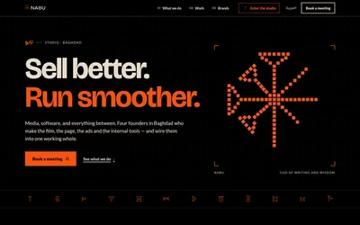
Completely different, as asked. 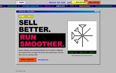
What a brief about the early web does to a page.


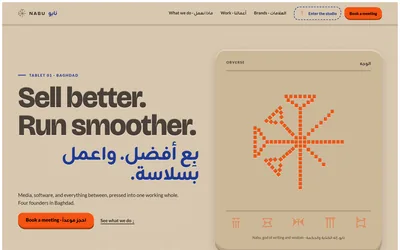
Clay tablet, with lapis. 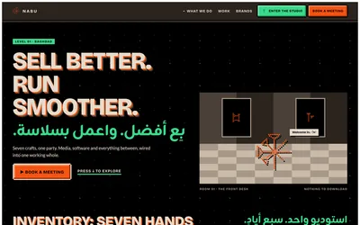
Pixel game world. 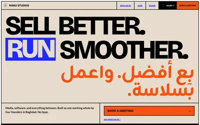
Raw brutalist web.


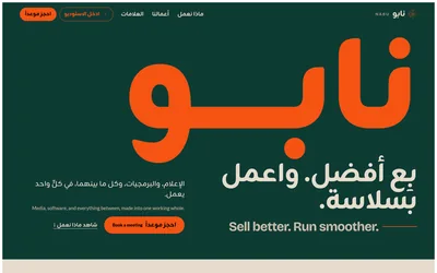
Arabic first. 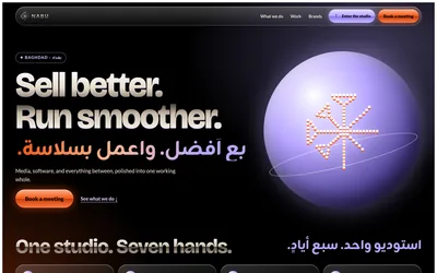
Chrome and gloss. 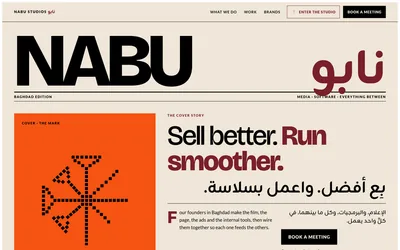
Glossy magazine.


Turning the volume down
An hour and a half after the six directions, a little before midnight on 6 October, we wrote a different brief. It said the market is full of studios selling generic work made from prompts, and that we are the opposite. It said never to claim taste or effort in words, because the design has to prove them. And it asked for an editorial page, clean and confident, with plenty of white space: “Restraint is the point. The orange mark is the single distinctive element.”
It listed what to avoid: dark pages lit with neon gradients, glowing orbs, glass, stock photos and AI-made pictures, layouts that look like every software company's, and the clichés of our own heritage: the Ishtar Gate, the lamassu and papyrus textures.
The hero it describes is still the page's hero today: an almost empty frame with the mark, the name and one line, “From the first idea to the last pixel.” What sits under it has changed since. As drawn that night, it went on with how we work, before what we do, because we sit with a business before we build anything for it. Then three areas, each written as an outcome rather than a service. Then the businesses we've sat with, and the people a client will actually work with, because, in the brief's words, “AI studios are faceless; we are not.” Then a door to something we made for the curious, and a form that asks the owner to tell us about their business.
The design took under an hour. Every change we asked for after its first draft was about the hero. The page below it stayed as drawn.

Starting over, on purpose
The next evening, 7 October, we opened a new project instead of reworking the old one. The old site wasn't broken: its foundations were sound, and plenty of them came with us. What it carried was a summer of decisions made for a brand we no longer had.
What came across was the way it was built: plain files any host can serve, every word kept in one file per language and checked by type, and a check that weighs each page's code. So did Iraq as our market, and WhatsApp beside the form. The clay, the booking calendar and the paid check-up we used to offer stayed behind.
The plan had fourteen tasks. The core of the site went up in one day, 8 October, and that afternoon we laid it beside the design, page by page, in both languages, at desktop and phone width. All eight pairs came out exactly the same height.
Where the build differs from the design, it's on purpose and written down. The design used the logo's capitals as the company's name in titles and the footer; the site writes Nabu Studios and keeps the capitals for the logo. A few colors got deeper where the design's own failed a contrast check, and the hero flashes more often than the design had it, because we asked it to.
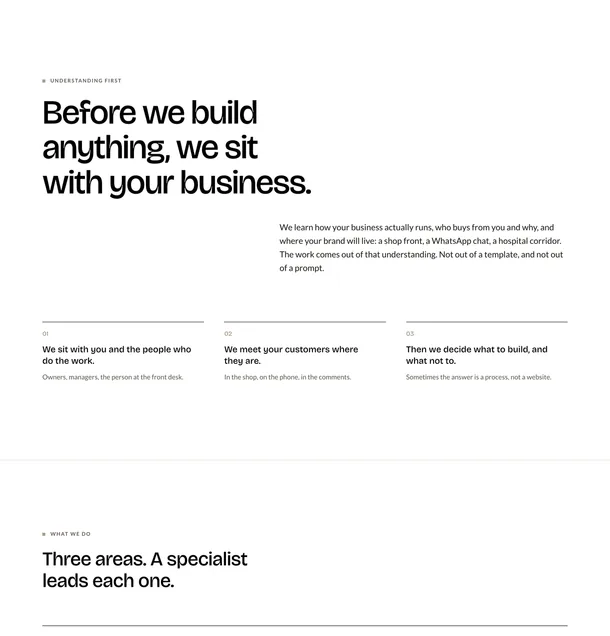
The design. 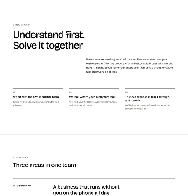
The build, in October. The layout is the design's; the words have been rewritten since, first on 13 October.


Arabic, written as Arabic
Each language has its own pages, and every word a visitor reads lives in one file per language, both held to one shared shape. If a sentence exists in English and not in Arabic, the site refuses to build.
Arabic also gets its own type, tuned for Arabic rather than the English scale flipped around. Body text is larger and more open, 19 pixels at a line height of 1.8 against 17 at 1.6 in English. Headings are heavier, labels are never spaced out letter by letter, arrows point the other way, and phone numbers, email addresses and our logo stay left to right inside the Arabic around them.
On 13 October we rewrote the Arabic as Arabic. The first draft had smuggled English idioms across, like sitting “with” a business, or a brand that “lives” somewhere. Those went, and Mesopotamia took its Arabic name, the land of the two rivers. On 28 October the voice loosened too: plain modern Arabic stays underneath, and the home page's headings, asides and buttons speak Iraqi.
The Arabic pages number their parts in Arabic-Indic digits, and every test passed. But the Arabic typeface draws those digits with Western shapes, so on screen they still read 01, 02, 03. A design review on 13 October caught it, because the tests read the text, not the pixels. The fix is a 3 KB font that holds only the ten Arabic-Indic digits, with its line spacing matched to the main typeface, so a line with a number in it keeps its height.
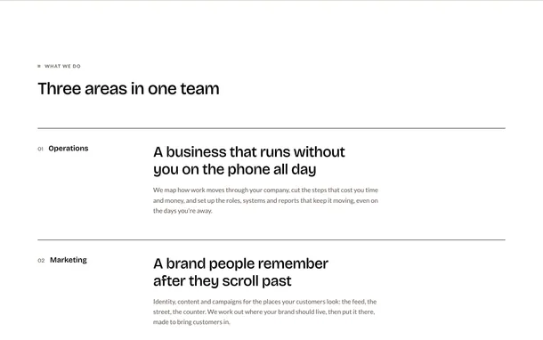
What we do in October 2026, in English. 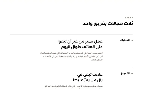
The same section in Arabic.


export type Localized<T> = { en: T; ar: T };
// …
const ARABIC_INDIC = "٠١٢٣٤٥٦٧٨٩";

function localeDigits(digits: string, locale: Locale): string {
  return locale === "ar" ? digits.replace(/\d/g, (d) => ARABIC_INDIC[Number(d)]) : digits;
}108 squares that won't sit still
The hero is our mark and nothing else. When the page opens, its 108 squares fly in from a scatter and turn orange as they land. Point at it and off they go again.
Where each square starts, how far it turns and how long it waits are worked out once, when the site is built, from a fixed seed, and written into the page. The movement is plain CSS. So the first thing a visitor sees never flickers, and nothing waits for a script to show up.
Behind the mark, four prints flash in turn, each for a moment: a wall of cuneiform signs, a pop-art grid of the mark, a risograph halftone and a woodcut. We wanted them early, “so it is not like an easter egg”, and the first comes 1.3 seconds after the page is ready. The cuneiform wall draws the 32 signs of our brand's own set, traced from the brand's pattern.
Then a review measured them. As first built, the flashes changed a large part of the screen several times in a quarter of a second, close to the limit the web's accessibility guidelines set for flashing, and nothing could stop them. Now each square of the dissolve opens once and closes once, the prints play one round and stop, a button in the corner pauses them, and anyone whose phone or computer asks for less motion sees the mark whole and still, with no flashes at all.
On a phone held upright the mark and the name take most of the screen's width, and prints laid out for a wide screen landed behind them. Since November they're drawn into the bands above and below instead.
The prints load only when the browser has nothing better to do, so they never hold up the first paint and don't count toward the page's weight.
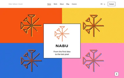
Pop art. 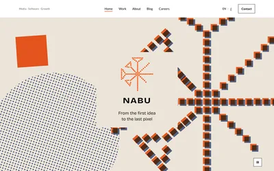
Risograph. 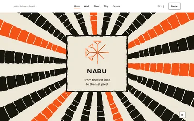
Woodcut.


export function scatterSquares(mark: MarkData, opts = SCATTER): ScatteredSquare[] {
  // …
  const r = rng(opts.seed);
  return mark.items.map((item) => {
    const dx = cx + (r() * 2 - 1) * vw * opts.field[0] - item.cx;
    const dy = cy + (r() * 2 - 1) * vh * opts.field[1] - item.cy;
    const rot = Math.round((r() - 0.5) * opts.rot);
    const delay = Math.round(r() * opts.stagger);
    return { d: item.d, dx: Number(dx.toFixed(1)), dy: Number(dy.toFixed(1)), rot, delay };
  });
}Plain files, and code on a diet
The site is a set of plain files. No server of ours behind it, no database: every page is built ahead of time, in both languages, and any host can serve it as it is.
A page with no scripts at all is possible, and the earlier site had exactly that. This one needs a little code, for the mark, the slider of our work, the form and remembering the language a visitor chose, and the framework's own runtime tags along. So instead of zero it has a ceiling: the home page's JavaScript may not pass 241 KB, compressed, and the check fails the build if it does.
Every ceiling is set the same way: measure the page when it's first finished, add a tenth, and write the date beside the number. The first measurement, on 8 October, came to 292 KB, and its ceiling of 323 KB would have protected exactly the weight we wanted gone. The biggest single piece was the library that checks the form, at 94.5 KB. We moved to its smaller edition, which comes to 21 KB, ran 74 test inputs through both to make sure every answer matched, and the page dropped to 219 KB. The ceiling was reset from there.
The studio walk, the 3D piece behind “Explore our world”, was briefed as a portfolio you can play, one that “proves our craft without claiming it”. It weighs more than the home page on its own, so it lives on its own page and the home page never loads any of it. The same check fails the home page if it so much as refers to one of the walk's files.
Fonts are the other weight a page downloads first, so each language preloads only its own. The build tool keeps one list of fonts for the whole site, which would have every page preload both languages', so a step after the build writes each page its own list. Pictures and videos followed in November: each ships in two formats, a newer, smaller one and an older one every browser plays, and the browser takes the smallest it can.
// Set on 2026-10-09 after the hero's mark data moved into the lazy art chunk: measured 217.7 KB
// for /en/ and 218.8 KB for /ar/; the larger value times 1.1, rounded up, is 241.
// The limit before (243) was measured with the mark data in first-load JavaScript, 1.7 KB heavier,
// and the first limit (323) on the classic zod build, about 94.5 KB gzipped heavier again.
export const HOME_BUDGET_KB = 241;Checked by machines, then by people
Every change passes the same gate before we call it done: the type checker, the linter, the unit tests, a clean build, the weight check, and a browser that walks every page in both languages at desktop and phone width. It checks that each page runs in the right direction, never scrolls sideways, keeps the keyboard's focus visible, and passes an automated accessibility scan with no exceptions.
The tests can't reach the outside world. Each one runs inside a guard that blocks any request to another host and fails the test that made it, and one test fails on purpose to prove the guard still works. No test can ever send a real inquiry to a real inbox.
Automated checks only go so far, so on 13 and 14 October the site also went through three reviews, each with one brief: design, usability and accessibility, and performance, at three widths in both languages. They sharpened the details a scan can't see: a pause control for the hero's flashes, a mark that settles back after a tap on a phone, and a stronger line under each form field. All of it was in within hours.
The reviews also asked for a first screen that says what we do and carries a button. We kept it almost empty. That quiet first screen is the decision this whole page is about.
We designed this site and directed every round of it. AI tools drew many of the design rounds from our briefs, AI coding agents wrote much of the code, and AI reviewers ran those three reviews. Nothing counted as done until it passed our written specs and the checks on this page, and until we'd seen it with our own eyes.
// The site is a static export with self-hosted fonts, so a page makes no request to any other
// host. Anything that does, including a form posting to a real endpoint once one is configured,
// is blocked before it leaves the machine and fails the test that made it.
const LOCAL_HOSTS = new Set(["localhost", "127.0.0.1"]);

export function isOffHost(url: URL): boolean {
  return (url.protocol === "http:" || url.protocol === "https:") && !LOCAL_HOSTS.has(url.hostname);
}Where it stands, for now
The site runs in English and Arabic, at every width from a small phone up. The English home page carries 195.8 KB of JavaScript under its 241 KB ceiling, and the Arabic 196.8 KB. Every change passes the full gate described above.
The home page has moved since October. In November a slider of our work took the place of the client list and the wheel of three areas, and how we work moved below it. The first screen is as empty as it was.
In November 2026 the site holds the stories of our first three clients, beside three of our own: the identity, the walk and this page.